Friday, 26 February 2010

Preparation for our horror teaser trailer

To prepare for our horror trailer we had a lesson in which we learnt how to create fake wounds and how to make injuries look real. The lesson began by watching several horror film sequences where fake blood is used.

We learnt:

  • fake bleeding
  • how to fake being sick
  • how to hide the impact of punches
  •  and other methods to make it look like someone is being hurt by a weapon


We used grenadine syrup which is usually used in cocktails and therefore it wouldn't be a problem if got in someones mouth. It makes a good fake blood as it has a thick texture and doesn't dry up. To create a fake wound, a layer of latex is put on the skin to outline the shape of the cut. This dries up and more layers can be added. Eyeliner or another black substance can then be added to the centre of the cut to make it look infected and dirty. The fake blood is then added on top.
 Below are my original photos:

I took this photo for my magazine cover. I looked at existing EMPIRE magazine covers and I found that they usually have a picture of the actor on the front cover with cover lines relating to the movie and the actor, for example on my magazine cover it says, "We chat to the stars of Skin Deep" and "Fern Anderson reveals all in an EXCLUSIVE interview!"


Another member of my group took this photo, which I used for my poster. I edited it a lot on photoshop, removing the eyes and making it very dark to make it look scary and mysterious.
I took this photo to use on my magazine cover. I noticed that most existing EMPIRE magazine covers have a smaller picture in the bottom left hand corner, so I used this and wrote, "BEHIND THE SCENES PHOTOS!"

Vladimir Propp's character analysis in relation to 'The Shining'

The Shining, directed by Stanley Kubrick (1980) starring Jack Nicholson.
Character roles

•Villain - Jack Torrance

•Donor - Stuart Ullman

•Helper - Tony & Dick Halloran

•Princess - Wendy Torrence

•Princess's father - Danny Torrence

•Dispatcher - Stuart Ullman

•Hero/Victim - Danny & Wendy Torrence

•False Hero - Jack Torrence

Narrative structure

• Preparation

1. A member of family leaves home - Jack leaves his home for a job interview at the Overlook hotel. After getting the job his moves his wife (Wendy) and son (Danny) to the hotel for winter.

2. A prohibition or rule is imposed on the hero - Wendy is told not to enter the room while Jack is working. Danny is told not to enter room 237.

3. This prohibition is broken - Wendy enters Jack's area losing his trust. Danny goes into room 237.

5. The villian learns something about the victim - Jack learns of Danny's "gift" and that he is asking/contacting someone to help them. Jack beleives that Wendy is untrustworthy.

7. The victim unknowingly helps the villian by being decieved or influenced by the villian - Wendy was simingly decieved to stay at the hotel and by being there she is helping to provoke Jacks mental health.

8. The villian harms a member of the family - Jack mentally harms Wendy and Danny. He also tries to harm the later by chasing them ith an axe.

•Complication

8a. A member of the family lacks or desires something - Jack wants to be a writer. One of his reaseon for moving to the hotel was the change to write in solitude.

•Transference

11. The hero leaves home - Both Wendy and Danny leave home to be with Jack at the hotel. This occurs much earlier in the narrative howeve.

12. The hero is tested, attacked, interrogated and as a result, recieves a magical agent or helper - Danny is attacked in room 237. Wendy and Danny are also both interigated. Danny uses the shining to get help and Dick Halloran comes.

•Struggle

16. The hero and villian join in direct combat - Jack goes after Danny with an axe into a maze. Jack tries to attack Wendy, using an axe to get through a door, and Wendy stabbs Jack in the and.

18. The villian is defeated - Jack is lost in the maze.

•Return

26. The task is accomplished - Wendy and Danny both survive and escape the hotel.

•Recognition

30. The villian is punished - Jack dies by freezing so is punished for his evilness.

Wednesday, 24 February 2010

Final Product: Ancillary texts

My finished magazine cover and poster:


Existing horror posters and magazine covers


What have you learnt from your audience feedback?

From my audience feedback, there was a shared opinion that we had overused the photoshoot sequence where we see the binary oppositions of models and death, although some people were in favour of these. The audience also felt that the soundtrack only worked up until the shot of the killer in the rear-view mirror. Afterwards, when the pace of the teaser trailer increased, the soundtrack didn't work and didn't build up enough. Some even suggested that the soundtrack was a little flat and that there should be some dialogue. The shot of the eye closing at the end was not popular with everybody as they felt that it didn't really fit in with the sequence. Someone also commented on the 'Skin Deep' inter-title, saying that it wasn't clear enough.
However, we did recieve a lot of positive feedback. The mise-en-scene seemed to be popular with everyone, they liked the darkness and the forrest location, someone even picked up on the link between beauty growing and the forrest blooming. Some of our shots and angles were praised, the shot of hand dragging along the floor, the axe going into a tree, the clip of the girl running and the camera shaking while it follows closely her and then appears in front of her, the killer coming out from behind the tree when the girl is tied to it, the close-ups of the girls that are tied up - the blood and rain on their faces makes it look like they're sweating, the mobile phone sequence with the close-up of the text message and then reaction shot, and shot of the killer in the rear-view mirror. Someone commented on the the sentence that we split in two for our inter-titles, "beauty is only skin deep.." "a knife goes in deeper" saying that they liked the way we had taken a cliche phrase and twisted it. Our teacher said that the beginning of our trailer with the driving sequence and the car screeching to a halt looks like it could be a professional production and that the continuity was very good. I think from our feedback it would seem that it worked as a teaser trailer, and that most of the class were intrigued enough to go and see it. I feel that if we had managed our time better/had more time we could have improved our trailer, especially the sound. Due to the heavy snow over our filming period it was hard to get the shots because our location (the forrest) was covered in snow, so that set us back a bit.

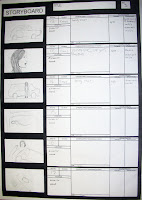
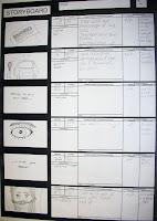
Our storyboards


Tuesday, 23 February 2010

How effective is the combination of your main product and ancillary texts?

The teaser trailer, poster and magazine cover are really important when trying to draw in an audience. The movie poster is designed to capture and distill the appeal of the film. For example, the stars, theme, genre, credits and often a tagline to whet audiences' appetites. The poster and the trailer are controlled by the same distributor, along with other audio-visual content such as short and extended clips and making-of material shot on set during production. With a dozen or more different posters on display in a cinema foyer at any one time, there is a lot of competition and distributors and their designers must work hard to make each one stand out, without being untrue to the film.

I went for the simplistic yet effective look with my poster, I've found that sometimes when something is simple and plain it is more attention-grabbing than something thats really busy and detailed, it stands out. I used a picture of the killer on the front and edited it so it looked dark and eery. I kept the detail to a minimum, with just the name of the main protagonist and the director, the name of the movie, the credits, and the age restriction. I used a colour scheme of black, red and white. I put the white mask onto a black background, I think this contrast is really effective. I then wrote the actress' name and directors name in red to connote blood. Behind the title 'Skin Deep' title written in white, I added a dripping blood effect.


For my magazine cover, I created my version of EMPIRE magazine. I used a picture on the front of the main actress and although she is not in character, she has a serious but intriguing look on her face. I used cover lines such as "Fern Anderson reveals all in an EXCLUSIVE! interview," "Behind the scenes photos," and "We chat to the stars of Skin Deep." These are the sorts of cover lines you see on magazine covers when big movies are released. I didn't worry so much about this linking my magazine cover to my trailer and poster because it wouldn't be controlled by the same distributor.
The trailer and poster combined create a lot of publicity. If you don't see the trailer, you are likely to see the poster displayed on buses, bus stops, billboards etc which will hopefully make the audience want to look for the trailer on TV or even YouTube. Therefore the poster plays a very important part in advertising. Although I used a picture of the killer on my poster, he is wearing a mask and it is a very dark picture so you can barely see the killers eyes, this creates a sense of mystery and intrigues the audience. I used the same inter titles in our trailer as a tagline on the poster, "beauty is only skin deep... a knife goes deeper." I thought this was a good touch because if the audience didn't recognise the title of the film, that line may have stuck in their head because it's a common phrase turned on it's head to be dark and shocking.

How did you use new media technologies in the construction and research, planning and evaluation stages?


Click on the photos to view comments:


Above is a still of our project on Final Cut Pro. As you can see there is quite a lot going on visually, as this still is taken from towards the end of the trailer where the pace is very fast to create suspense. You can also see where we have used fade in/out at the beginning and end of clips. In our trailer there is often more than one noise going on at once and sometimes they would overlap, which you can see from the picture above.

I found this program quite hard to get the hang of, but once I had, it was fairly straight forward. I found it   really interesting to see how trailers are made and all the different effects that can be used, such as slowing down/speeding up a clip, changing the colours, fade in/fade out etc.

Our finished teaser trailer, "Skin Deep"

In what ways does your media product use, develop or challenge forms and conventions of real media products?


In both of these shots, the character is tied up with their hands behind their back.This is a really common theme in horror movies, the spectator automatically assumes they are going to be tortured. The lighting is very similar in both shots, it is dark and eery and barely allows us to see their surroundings, which leaves us feeling more on edge. The differences in the shots are that the Hostel shot is very much more an establishing shot. We see the characters whole body, he appears to be in an empty room but as the lighting is very low-key we are unable to see what is lurking in the darkness. The shot from Skin Deep, is a medium shot of the character, we can see that she is tied to a something and we can just about see the killer behind her. Both shots very much follow the horror movie conventions.


Although the font colour and style is different in these inter-title shots, they both have their sentence split up over different inter-titles with four or five words on each. This technique is to keep the spectator guessing, we get part of the sentence, then a series of clips from the film before we get the rest of it. Both shots have conventional black backgrounds and the text is centred in the middle of the shot.


These two shots of the killer are very similar. In teaser trailers, you only get to see the killer once or twice, this is to keep the audience guessing and not give too much away. Also, too many shots of the killer could result in losing the sense of mistery.  Both killers are wearing masks, this is a common feature in horror films as it hides the identity of the person behind the mask and creates fear within the spectator. The masks are also fairly similar, they both cover the whole face with only eye holes and circular holes to breathe through. Again, both shots are very dark and eery, we are unable to see beyond the killer and can't see their surroundings which creates suspense and tension.


Extreme close-ups are often used in horror films, they disorientate the spectator because its hard to tell what exactly is going on which provokes a sense on mystery and tension. Extreme close-ups of an eye is particularly common, as this is the place where we can really see the fear inside the person and it allows us to identify with them. We begin to care about them which allows us to feel scared for them and hope that they stay safe and don't get hurt.The lighting in the shot from My Bloody Valentine very strongly contrasts dark and light, creating chiaroscuro. The light is so bright that its hard to see detail on his face, drawing all our attention to his eye. The shot of the eye from our trailer, Skin Deep, is overall fairly dark but has highlights on the skin around the eye, making the the eye itself stand out and look dark.


Both of these shots have the conventional black background and both take place within the last few seconds of the trailer. The text is in the centre of the frame, although the font and colour is different. I think both are effective, the SAW V1 font is metallic and connotes weapons, possibly a blade. The Skin Deep font looks like blood dripping.

These two shots are very similar. In both of them we see a close-up of a girl being gagged with a look of despair on her face. The background is very dark and slightly distorted adding to the confusion. We don't know where they are and it looks like they don't either.


Although these are very different shots, I compared them because I liked the idea of the hands struggling to escape, trying to break free. In both shots the character has been put in a position where they can't escape.
As usual, its taking place at night time in a dark and what must be, isolated place.


These two shots are set at different times of the day, both connote freedom and escape. These shots are very effective in horror teaser trailers because it shows that the character is running away from something. Also, these shots are in sharp contrast with the shot of the character being tied up or locked away and this makes the audience ask themselves the questions, how did they escape? did they get away? what happened afterwards? It makes the spectator want to see the film to find out.


I thought these two shots were interesting, the same shot but in different locations. The shot creates a sense of tension in the spectator because we can see how far the character has to go. In the My Bloody Valentine shot, we can see the silhouette of the girl on the left hand side, although its not a point of view shot, we can see what she is looking at and we feel nervous for her. Although she is in a shop with high-key lighting, there are lots of obstacles and there is a lot to take in. We don't know where the killer is hiding.
In the shot from Skin Deep, we can see a point of view shot of a  little bit of the road ahead, lit up by the headlights of the car. The light quickly fades out and all we can see is darkness. Due to the POV shot we really feel as if we are in the characters shoes and we are on the edge of ours seats.

Conventionally, teaser trailers are shorter than the full trailer and are around 30-90 seconds long. Our trailer, Skin Deep conforms to this at 62 seconds. Teaser trailers are designed to let the audience know that the film is coming up in the near future and to add hype to the upcoming release. They often feature scenes or alternative versions of scenes that are not in the finished film, this is because they are often made while the film is still in production. The tease is generated by never letting the audience know exactly what's going on, partly because if they knew the whole story they wouldn't bother going to see it, and also because it creates mystery and intrigues the audience; they want to know how the protagonist gets themselves in the situation they've seen on the trailer and how/whether they get out of it. There is often some form of audience identification in a teaser trailer. This is so that the audience begins to "care" for the protagonist, which leads them to feel an emotional connection to them which sends them on an emotional rollercoaster ride throughout the movie. It is the same with a movie, at the beginning we get visually introduced to the main protagonist and their life, by seeing them at work, with their family, in their personal space (the home) etc.

Wednesday, 18 November 2009

Audience research

Are you male or female? 
Male - 14
Female - 14 


Do you like horror?
Male
Yes - 11 
No - 3


Female 
Yes - 7 
No - 7


Overall 
Yes - 18
No - 10


What type of horror do you like? 


What type of setting do you like?


Our results to "other" were warehouses and abandoned buildings.

My horror movie idea

Ria, a typical teenage girl from the small town of lowestoft, was spending the evening at her boyfriend's house. At about half midnight, Ria decided it was time to leave as they both had to be up early that morning. She said her goodbyes, got in her car, turned her music up and began her 25 minute journey home. She was singing away and tapping her thumbs on the the steering wheel when something in her rear-view mirror caught her eye. Her head sparply turned towards it and she had a closer inspection, nothing was there. She shook it off and carried on driving. Wary of what she saw, she turned down her music. As she drove along the deserted, dark roads, she could feel soft, warm air blowing her hair forward on the right hand side of her face. She frantically checked that all of the windows and doors were fully shut, they were. She couldn't understand where this warm air was coming from, she turned her music off. She began to hear faint sounds of someone breathing near her head. She inhaled deeply through her nose, her eyes widened and she pulled over immediately. She got out of the car straight away without even turning behind her to look in the backseat, she turned off the ignition and slammed the door. She figured if there was something or someone in her car that she would be able to see them through the window, and at least then she would be outside of the car. Her palms sweating, she looked closely through the window, she saw nothing, she opened the boot, she saw nothing. She slammed the boot shut and looked back along the road she had driven down, she put her hands on her hips as she breathed a sigh of relief. Before she knew it, she heard her engine start, she whipped around and watched her car be driven into the woods nearby. In a desperate attempt to get her precious car back and without further thought, she found herself sprinting as fast as she could after her car. The ground was bumpy and uneven and as she tried to keep up with the car she stumbled. She didn't give in, she could hear the sound of her cars engine so she knew it wasn't far away. She thought maybe the driver had freaked out, left the car and ran off, why could she still hear the car? As she got closer the car got louder and she could see the headlights peering through the branches. She finally got to her car and was horrified at what she saw and was possibly about to happen to her...

My group decided to go with my idea for our horror teaser trailer.

Tuesday, 17 November 2009

Horror moodboard

 
My mood board is a collection of pictures that I think we would be able to recreate and would be really effective in our horror trailer. In horror films, it's usually teenagers that are killed so this works in our advantage to make a believable horror move trailer. I like the idea of an abandoned house or church for the setting, so I think the background on my mood board works well.

Monday, 16 November 2009

Distribution companies

The job of a distribution company is to launch films into the market place and keep them there for as long as possible. The distributor has to bring each product to market, starting from scratch (except for a sequel) and realising its potential. To do this, distributors have to carry out market research. This is the systematic gathering, recording, and analysis of data about issues relating to marketing products and services. Once this has been carried out and the film is in the production stages, it's the distributors job to advertise, promote and distribute the film.

Before the film goes into production, a distribution plan is drawn up discussing the benefits and drawbacks to take into consideration in regards to the film's success. The distribution company, firstly, have to estimate what the film may earn (low/medium/high estimates) in order to prepare a budget to release it, along with all the related costs. The goal eventually is to regain all the costs and make a profit. Bearing in mind the huge amount of money that goes into making a film, the distributors have the all important job of making sure this happens. In reality, most films do not make a profit from their theatrical runs alone. The distribution plan comes under 6 sub-headings which I will talk about below.

Focus on the audience
Distributors need a detailed understanding of their target audience. For example, age group and gender, but also factors such as lifestyles, social networks, media consumption patterns - always informs the subsequent decisions on how and where a particular film is promoted in order to reach them.
Despite the distributors challenge to attract as wide spread audience as possible, known as a "break out" or "cross over," it's important never to lose sight of a film's core target audience. If distributors alienate their target audience and reaching out to different niche audiences fails, the product is not going to make it's money back, let alone make a profit.
The most frequent cinema-goers tend to be teenagers, students and young adults as they are the biggest media consumers of any age group. Therefore they are naturally the core audience for products.
Although cinema is the most popular out-of-home leisure activity for young people, there is still a competitiveness against other activities. Adults aged 35 and above have the lowest cinema attendance and the industry is working to encourage more visits from this age group, as this would increase a film's earnings massively.

Rolling the distribution dice

Audience tastes are notoriously unpredictable and unfortunately experience in the industry doesn't give you the skills to predict what the audience are going to go and see. Nobody can be certain what makes a hit or when and where it might happen, even with the best made plans. Also, just because one romantic comedy or action adventure played successfully to an audience, there is no guarantee the next release will do the same, maybe they won't want to see another one. It depends on the individual film and the marketing conditions. As it's such an unpredictable, product-driven business, each distributors earning, market share and profitability fluctuate year by year, reflecting the success or otherwise of individual titles.

The competitive jungle
Competition is always a primary consideration when developing release plans. Distributors need to take into account what other films are likely to be released at the same time and during the following weeks, especially those that are targeted at a similar audience. Is there a space in the market for something different? Are the most appropriate screens for this film available and likely to be offered? Projected release dates often change as competing distributors jockey for position week by week. They also need to ask themselves about the kind of film it is. Is it an event film for a mass market blockbuster or a specialised film for a more discrete audience? How were the lead star's last couple of films and how were they received commercially and critically? Are any cast members available for UK/international publicity or to attend a premiere? Is it a film for a holiday period? All these sorts of questions need to be answered and it's the distributors job to do that.

Satisfying anticipated demand
When releasing the film, distributors need to distinguish if their product is going to be a saturation release,'at cinemas everywhere' films may open simultaneously in 1,000 screens per multiplex. This strategy is usually for large-scale sequels or star-led holiday releases. In contrast, a foreign language film for example maybe comprise 25 prints or fewer.

Digital regeneration
The introduction of digital release has had a positive impact on distribution companies. The disks are significantly less expensive to duplicate than 35mm copies (around 10% of the cost), It presents new releasing and programming opportunities, for example digital 3D, live action and animation films, and they appear on screen in pristine quality and do not deteriorate over time.

Image and video hosting by TinyPic

Budgeting the release
Once the distributor has viewed the finished film and confirmed the release plan, they will then draw up and work to a comprehensive budget. Bearing in mind that in the UK, the distributors pay all the release costs including marketing, advertising and the duplication of prints (35mm or digital). This covers the launch and sustaining of the film post-release. The investment and projected returns can be reassessed subject to commercial performance week by week.

Complementing the distribution plan, every film has a detailed marketing plan. Distributors need to think about method of advertising is going to suit their target audience age group best. For example, older audiences may respond beset having seen a film advertised on television or in the press, whereas with younger audiences it is more appropriate to promote the film online, on radio stations or bus shelter panels.
Different advertising strategies are used for marketing. For example, posters, trailers and online and mobile, they are all great and essential ways to promote films.

Image and video hosting by TinyPic

The most expensive items on the budget, however, is advertising placed on broadcast channels, outdoor sites and in the press. Terrestrial television is traditionally the most effective visual means of reaching a mass audience, but the cost of TV advertising, costing many hundreds of thousands if pounds or more for a package of spots in all regions, is prohibitive for most film releases given their potential returns. Event films/blockbusters with top stars need heavyweight advertising to support their wide releases.

Thursday, 12 November 2009

horror genre essay

What are some of the key conventions of the horror genre?

A genre is a sort of contract, agreement or set of expectations circulating between audience and institution. Audience is a very useful concept because it helps us decide which media we want to consume, in a very media saturated world. Genre is also beneficial because it minimises the financial risk by enabling the producers of media texts to target pre-existing audiences.

The boundaries of genre are blurry and therefore it can be hard to distinguish where one genre ends and another begins. Although no single text can contain all the conventions of a genre, there are very typical conventions for the horror genre.
Horror films are usually set in small communities or isolated places, this offers more opportunities for a sense of isolation, or for a whole community to harbour a secret. For example in Eden Lake the two main protagonists are isolated in the woods and in The Shining they are in an huge empty hotel and find themselves snowed in. They are often places with a past which will inevitably return, for example, an abandoned house; this is often referred to as “the return of the repressed.” The houses in horror films are usually big with lots of different floors, cellars and attics, with more room for secrets to inhabit. Usually in these films, in the light of day everything seems very normal and innocent, but night time is a whole different story, playing on our pre-existing fear of the dark.

Image and video hosting by TinyPic

This is a typical house that you would see in a horror film. A fairly modern house in a nice, friendly, normal looking neighborhood that doesn't look in any way scary on the outside. It is a big house with lots of levels and even a balcony.

The importance of the technical code is essential to the horror genre. The camerawork is expressive rather than naturalistic; a lot of canted, weird angles are used to disorientate the audience. A common lighting technique in horror is for the source of light to come from a low angle, casting shadows that are unnatural to us. We are used to light coming from above, like the sun or lightbulbs. Extreme close-ups on the victim are a very common feature in horror; it enables the audience to identify with them and creates tension because we can’t see past them and therefore we don't know where the monster is. Sudden extreme close-ups on the monster is a popular technique in horror, connoting invasion of our personal space. Point of view shooting is also very important, subjective, hand-held or steadicam camerawork often places the audience in the monsters eyes. Clover (Men, Women and Chainsaws) argues this usually switches to the victim/protagonist/final girl as the film progresses. Both of these raise the issues about audience identification. Camerawork often makes use of the depth of the frame, for example we will see the protagonist in the foreground, unaware of the monster emerging in the background. The editing often creates unsettling jumps from long shot to close-up, rather than the smooth use of medium shot which creates suspense for the audience. When the camera quickly jumps from long shot to close-up, it is often paired with a loud noise to make us jump. Sudden increases in editing pace when there is no apparent threat creates a feeling of jumpiness and keeps the audience on the edge of their seats. We often hear sounds which increase in pace, for example footsteps or heartbeats.

Image and video hosting by TinyPic

This is an example of low-angle lighting, the light is coming from the below which is an angle of light we are not used to. Also, this picture shows a common shot in horror films, the protagonist in the foreground and the monster emerging in the background.
Visual signifiers of the genre are readily apparent, the colours black and red have obvious connotations of blood, darkness, evil etc. The low-key, low angle lighting emphasises the shadows, something that is a common feature in horror films are they are mysterious. The light coming from down below connotes hell, bonfires, primitive instincts etc. A selection of the commoner objects in the mise-en-scene would include weapons (particularly bladed), blood, masks, icons of the supernatural (ghosts, moving objects) and religion (crucifixes, pagan symbols). Also, Levi Strauss’s theory on the iconography of childhood/innocence, for example this still from The Ring:

Image and video hosting by TinyPic

The classic realist Hollywood narrative structure is normality, enigma, path to resolution, closure, or hero, agent of change, quest, resolution, closure. This is largely applicable to genre, although there may be “false closures” and the real closure often left ambiguous for two reasons; to suggest mythic quality of the monster or to enable a sequel. This conception of narrative structure is based on Todorov’s theories. As a main protagonist, the “final girl” of the slasher and many other horror films is a victim/hero rather than a simple hero, and this provides a point of masochistic identification for the spectator which is more complicated than in many other genres, this is somewhat problematic in many horrors. The narratives of some sub-genres, such as the slasher, are very formulaic. A childhood psychotic event creates a killer who returns to a past location on an anniversary (return of the repressed) to kill again. It is usually a group of stupid, immoral teenagers, and the “final girl” is usually the virginal and slightly masculine girl. Often, horror uses the use of binary oppositions, for example innocence/evil, hence the use of dolls, fairgrounds, nursery rhymes etc. An example of this is at 1:00 in this trailer for A Nightmare On Elmstreet, we can hear a little girl singing. The contrast of her innocence and the horror that is going on around her make its really chilling and effective.

http://www.youtube.com/watch?v=B-tSvrkKx2Y

There are typical character types for this genre. The main protagonist is often the “victim/hero” – the person we identify with, the monster usually has a hidden secret or made psychotic by an earlier event and the stupid, immoral teens get killed. There are often children involved too, which relates back to the binary oppositions (innocence/evil). The police are never any good in horror films- they never save anyone.

Some interesting themes of horror is the binary oppositions theory, the return of the repressed and Freudian’s theory on how horror is often close to sex in some way, the hidden evil inside and the idea that watching these films lets out our “inner monster”, and the prolonging question- what lies on the other side of death?

Tuesday, 3 November 2009

teaser trailer 3


The trailer begins with shots of grimey places with slow, spooky music. 'There is a place' lands on our screen and with it is a loud crashing sound, the music carrys on and then with clauses inbetween, 'where all your darkest.. sickest fantasies.. are possible.. where you can experience.. anything you desire.. where you can torture, punish, or kill.. for a price.'
The clips get more rapid towards the end as the music builds up the tension. There is no voice-over, in fact we don't hear any speaking throughout the trailer. We are told the directors name, "from the brilliant minds that brought you Cabin Fever, Texas Chainsaw Massacre and Kill Bill, Quentin Tarantino's.. HOSTEL.'

teaser trailer 2


The trailer begins a little boy's voice saying "I'm not acting scared but he is," then we see a shot of the boy talking into the mirror. Children are often used in horror films because they are so innocent, the contradiction makes it scarier. Although the visuals in the first half are not necessarily dark and creepy, the sounds we hear are.
We have tension building music; a long note that gets louder, children laughing, a woman screaming, doors opening. In this trailer, at the beginning it's the sounds that tell us that it is a horror movie, the visuals show a nice modern family home, which is very typical of the horror genre.
We don't find out the name of the movie until almost the very end. We see clauses.. "within these walls... lives an evil... beyond our world... MIRRORS" The only name we see in this teaser trailer is Kiefer Sutherland.

Thursday, 22 October 2009

teaser trailer 1


This is the trailer for Saw 6, straight away we know we are watching a horror trailer by the darkness and the screams. The repitition of grammatical structures is a give away to the movie, 6 chances, 6 lessons, 6 choices, then finally Saw 6, this language device is used for emphasis, memory and emotion. The teaser is not just clips of the film, its made specifically for the trailer with special effects, they have a big budget, which is essential to please the demanding Saw fanatics.
The producers of the film can get away with doing very little in the trailer in terms of introducing the film because it being a sequel means the films already have a strong fan base, there is no dialogue and no voice-over, the visuals speak for themselves.
As soon as the trailer begins we hear this repetitive tension-building music that resembles a train going along a track, the music gets louder and more dramatic as the trailer progresses to really build up the tension, then 'Saw 6' lands on the screen as the loud music comes to its last note. Amongst this, we can women screaming, a dead giveaway to the genre of the film.

Thursday, 24 September 2009

the return of the repressed

THE RETURN OF THE REPRESSED

"Freud coined the term "return of the repressed" to explain the existence of neurotic symptoms. He theorized that an unconscious thought/feeling (Id derived) would constantly press for access to the executive fictions of the mind in order to be discharged. The Ego would be on constant alert to prevent the direct expression of the forbidden idea but the idea would find a disguise and surface as a symptom.

For an example, consider an only child whose parents are having a second baby. First born children live in a special world in which they are the center of their parents' universe. Those who are fortunate enough to have a younger sibling must negotiate the loss of their special position and the difficult emotions that are stirred up by the demotion. Typically, there is a mix of love, excitement, and trepidation at the arrival of the new baby; when the child realizes the newcomer is going to get much of the attention that used to be all his, anger at the interloper ensues. The child then learns that open expressions of hostility are not met with approval by his parents. The anger goes underground and eventually becomes unconscious. Often, as part of that process, the child professes his overwhelming love for the baby (a defense known as "reaction formation" is involved); the unconscious anger toward the baby then reveals itself in the child's attempts to "love it to death." Wise parents do not leave 3 year olds alone with infants. Eventually, the child manages to find ways to deal with his anger in acceptable ways and ideally learns that his love for his sibling outweighs his childhood resentment.

In cases where the growing child is never able to resolve the conflict between his anger and attendant wishes to do away with his sibling and his guilt and shame over such terrible and unacceptable feelings, the anger remains in the unconscious mind, forever looking for ways to express itself. "


In horror films, the 'return of the repressed' is a common theme. It's the idea that a bad memory or experience has been repressed for many years in the unconcious mind and suddenly it is back to cause havoc. For example, in Halloween the young boy kills his sister when he is very young, this is then repressed in his mind for years until one day when he is grown up it comes back and he starts killing people again. Freud had a theory that people have bad experiences repressed in their unconcious mind that they are unaware of, but it will come out eventually. For example, when you see something that you're afraid of but you're not quite sure why.

Thursday, 17 September 2009

horror movie trailer - my bloody valentine


I like this trailer because it's very good at tension building. Each clip is short lasting about 2 seconds, we don't know what we're
going to see next which keeps us on the edge of our seat. Towards the end as the clips get even shorter, we hear the sound
of a heartbeat, which gets faster and faster along with the clips. Throughout the trailer, there are lots of sudden loud noises and
spooky sounds to make us feel scared.
Genre - Straight away, it is clear that this is a trailer for a horror film. After an establishing crane shot of the location, within two second we find ourselves underground in an enclosed space, with a deep male voice saying "Exactly what did you see? Something was following us," this is very typical of a horror movie trailer. Our assumptions are confirmed when we hear a woman talking on the radio, "This is the most horrific event this town has ever seen, authorities are calling this the valentines day massacre."
Name of the movie - We don't find out the name of the movie until almost the end of the trailer. Blood red, bold, disintegrating writing appears on the screen on a black background (typical conventions of horror). We also hear the voice-over saying "My Bloody Valentine, 3D."
Production values - The film is not sold on the actors or the director. We don't find out the names of any of the characters or the director, all we know from the trailer is that it's a Lionsgate production.
Target audience - The trailer shows the beginnings of the scary scenes, for example we see the man in the gas mask about to stab the girl but we don't actually see it. The target audience want to be scared so this appeals to them.
Music - All we hear are screams, voice-overs, radio talk, and near to the end a heartbeat sound getting faster.
Dialogue - The voice-over tells the story and gives the complication but no resolution - it tells us about the valentines day massacre.